It’s a common problem for horizontal bar charts created in Excel 2007 to appear cramped in Excel 2010. A hidden setting in the Format Axis options resolves this issue, ensuring the chart displays correctly. Discover a practical solution to this technical issue you’re experiencing when switching charts.
📈 SOLUTION TO CHART STUCK DURING EXCEL VERSION SWITCH (FROM EXCEL 2007 TO 2010)
Following feedback from one of our users, we noticed that a horizontal bar chart consisting of two data points created in Excel 2007 appeared absurdly cramped when opened in Excel 2010. It was as if a significant portion of the chart had been squeezed by an invisible hand.
⚙️ Source of the Problem: Format Axis Option
After some research and tinkering, I discovered the cause of this strange behavior: In Excel 2010 and later, there’s a change to the default behavior of chart axes.
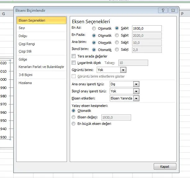
When I looked at the axis settings to fix the problem, I found a setting right at the beginning of the Format Axis options (usually located on the first tab) that limits the series.
✅ Simple and Quick Solution
The process to fix the chart congestion problem was extremely simple:
- Select the axis that appears congested in the chart.
- Right-click and open the Format Axis option.
- Set the setting that constrains the axis (its name may vary depending on the version and language, but it’s usually under the ‘Bounds’ or ‘Bounds’ heading) to Automatic.
With this small setting change, the chart started displaying as it should, at the correct scale and width. Sometimes, the most complex problems can be solved by overlooking the simplest setting. This experience has once again demonstrated the importance of checking the default settings during version upgrades.
Leave a Comment